
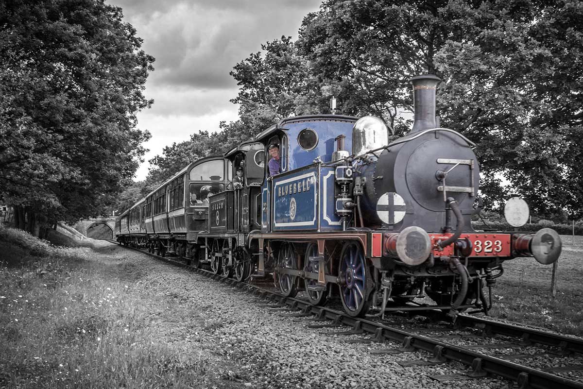
 This weeks episode of Creative Lightroom is all about selective colour, also known as colour popping. Now before you say this is a repeat of Creative Lightroom Episode 3 then let’s be clear how this is different. In episode 3 we used selective saturation to leave just one tone of colour (just the reds for example). Colour popping is more about keeping one area in colour even if the area has a mixed bunch of tones.
Where most photographers fail in this technique is by leaving the colours over saturated. That may be OK with a single colour but with mixed colours the end result can be very jarring on the eye.
So in this video I’ll show both how to colour pop and then how to control the popped colours,
As always it’s worth mentioning that if you’re a Photoshop user rather then Lightroom user, EVERYTHING I show in the video is the same as Adobe Camera RAW in Photoshop CC, CS6, CS5 and CS4.
[youtube]http://www.youtube.com/watch?v=ODidMT5Lm6g[/youtube]
Can’t see the video? Click here: http://youtu.be/ODidMT5Lm6g
Great video, cheers.
Thanks for another really useful video Gavin. Its all about getting to know your way around the different tools and how to use them in combination with each other. Your tutorials are great for getting the creative process going !
hi can you do a video on how to do this photoshop cs6 as i dont have Creative Lightroom
Thank you for another great video. I am really enjoying this series.
You say to make sure Flow and Density are 100%. I have never been sure what the difference between these sliders is. Any chance of a video explaining what they do, and when you might use them at less than 100%?
Thanks Gavin, seen you do this in PS previously but nice to see it in LR!
Super video I enjoyed the colour popping with more than one colour with lightroom… Thanks for the inspiration Gavin
Many thanks
very well explained