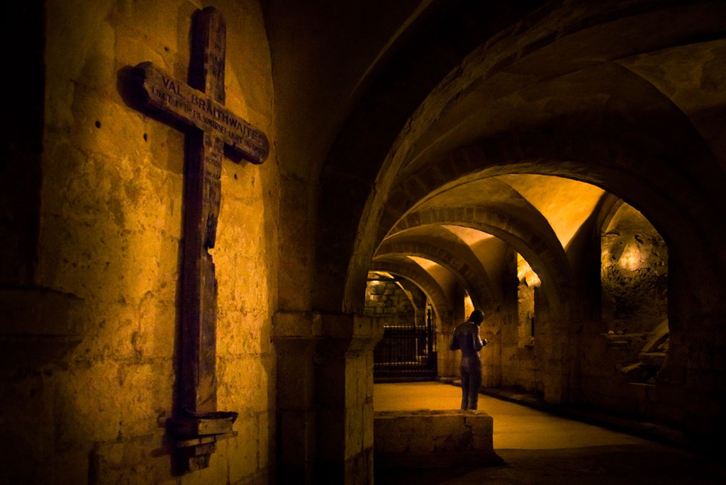
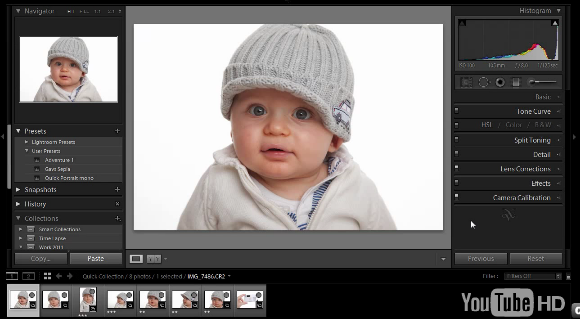
 Colours can be a very subjective thing, I might process a picture and push the colours towards the warm side, where as you might process the same picture but process the colours a bit cooler. On their own both pictures will look perfect, but viewing them side by side will highlight the colour difference.
Now you might ask the question, does that really matter? To which my answer would often be, no. If you’re happy with the colour then that’s fine. However there are certain times when getting the correct colour is absolutely vital.
Perfect colour rendition is vital if you’re a record photographer shooting, for example, a painting for a catalogue. But how many of us do that? No, the place I need perfect colour is shooting portraits and that’s why I use a grey card.
In my last blog post I reviewed the WhiBal card from Michael Tapes Design. In this post I’ll show you how I use the card in my Lightroom workflow.



 Back in September 2011 I held a camera training session at the Goodwood Revival. If you missed it, check out my blog post


 In my last post I showed you how to